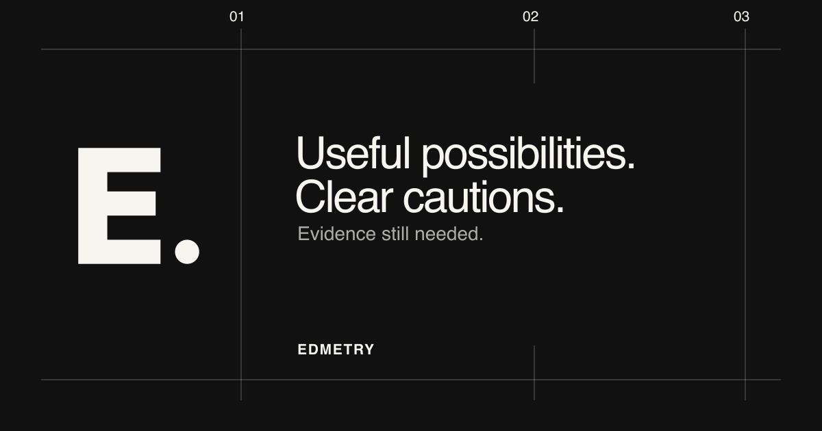
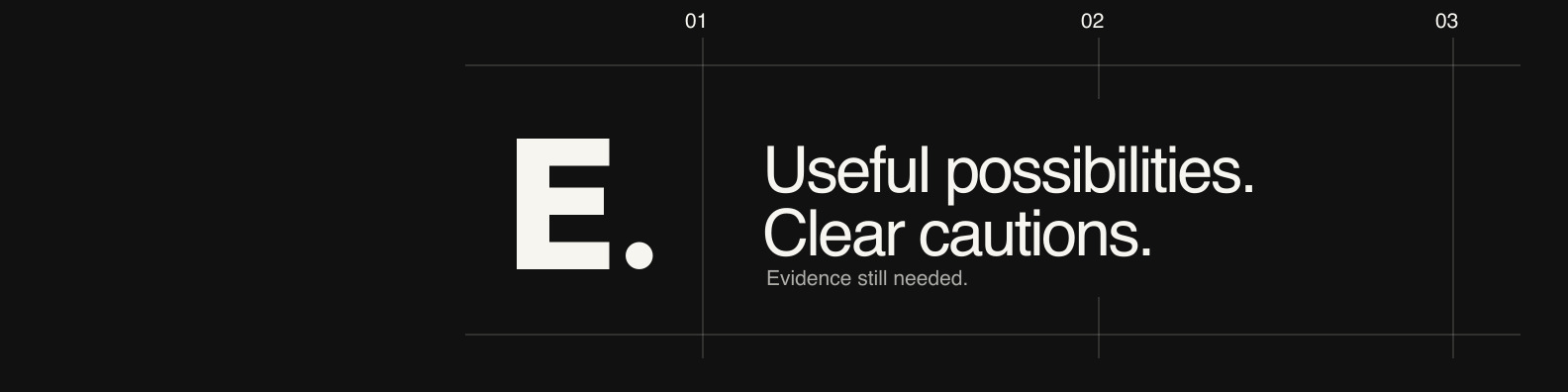
Edmetry visual identity

Centralised design.
For a coherent brand.

This page documents Edmetry's visual identity: the symbol, wordmark, colour palette, typography, and motion rules that make our publication recognisable without competing with the content.

Edmetry Edmetry symbol for light surfacesEdmetry symbol for dark surfaces
The symbol is the compact mark. The wordmark identifies Edmetry in text.

Core system

Symbol

Edmetry symbol for light surfacesEdmetry symbol for dark surfaces

The symbol is the block E with a circular point. It is the compact mark, used for favicons, avatars and other square placements where the wordmark would be unreadable.

Wordmark

Edmetry

The wordmark is the written name Edmetry. in the Inter Variable display face. It identifies the publication in text; its typographic E is a letterform, not a substitute for the symbol.

Colour

AaPaper
AaInk
AaMuted text
AaDark surface

The colour palette is deliberately restrained: paper and ink for surfaces and text, a muted secondary tone, and a dark surface variant, so the identity reads clearly on every surface.

Typography

Better questions. Clear, considered notes for school leaders. I l 1 · O 0 · b d p q

Inter is the display face, used for headings and the wordmark. Atkinson Hyperlegible Next is the reading face, used for body text, navigation and small labels, so the typography stays legible at every size.

Brand guide

Purpose and personality

Edmetry is an independent publication about teaching, educational technology, artificial intelligence, and the human decisions behind them. The identity is quiet, editorial and exact: it gives difficult decisions room to be examined and helps a school leader recognise the publication without competing with the decision or evidence on the page.

The visual system stays out of the way. It does not compete with the content, because the content is the point.

Accessibility and motion

  • Meaningful icons carry an accessible name; purely decorative icons use empty alternative text.
  • Contrast between text and background meets accessibility standards in both light and dark schemes.
  • Reduced-motion rendering reaches the settled state immediately; the masthead transition runs once, for a finite duration, and only after the page is ready.
  • Motion answers "what changed?" or "what's happening?" for the reader. It is communicative, not decorative: no infinite looping, no distracting effects, and nothing that delays reading.

Usage

Use the complete generated canvas with the approved surface variant. Preserve the aspect ratio and the clear space around the mark.

  • Use the light symbol on light surfaces and the dark symbol on dark surfaces.
  • Give a standalone symbol a meaningful accessible name.
  • Treat the word Edmetry in editorial prose as text, not as a logo image.

Avoid redrawing, cropping, stretching, rotating or outlining the symbol, and do not apply unapproved effects to the wordmark.

Approved assets

The assets below are the approved files for each surface, maintained centrally by Edmetry. Never hand-edit a generated variant; use the current files rather than recreating them.

Scalable symbols

Raster symbols

Browser & social

Platform canvases